Grace Bible Fellowship had a problem that a lot of growing churches share: their website didn’t look like them. Stock images stood in for real people, sermons were hard to find, and visitors had to click through layers of menus just to figure out when services started. The site worked, technically, but it didn’t represent a church that describes itself as "a church family where the Triangle will be brought to see, hear, and touch the diversity of God’s grace."
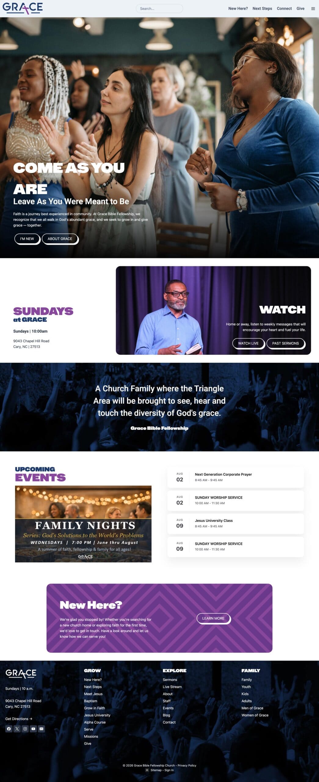
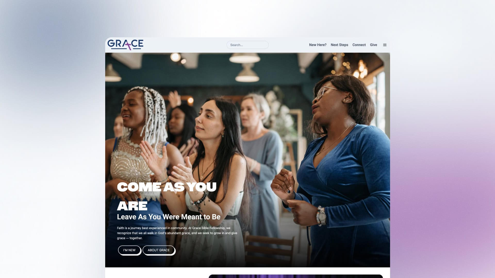
The finished site at gbf-nc.org tells a different story. It opens with real photography of Grace’s congregation in Cary, North Carolina, and it puts the information visitors care about — service times, directions, a plan-a-visit form, sermons, and next steps — within one or two taps of the homepage.
Discovery with the People Who Know the Church Best
We didn’t start with templates. We started with a multi-stakeholder discovery session — Tsion from young adults, Chris from church administration, and leaders from the women’s ministry, student ministry, and youth ministry all in the room.
What we heard shaped everything. Tsion said the old site made it "hard to find what you are looking for," while Herbert, the student pastor, wanted sermons "right up front." Aliyah put it plainly: "Stock images don’t represent us well." Rayna wanted the site to "reflect our brand — friendly, welcoming."
Discovery also surfaced a concern about reaching younger adults. The church’s membership trends older, and leadership recognized the need to feel current without alienating longtime members. Grace’s vision extends across the Raleigh-Durham-Chapel Hill Triangle, and the website had to communicate that reach naturally.
Creative Strategy: Three Stylescapes and a Visitor-First Sitemap
Our team developed three stylescape options in Figma — each with a distinct visual direction using Grace’s brand colors, typography, and custom patterns. Grace’s team reviewed all three through their Craft client portal and chose a direction that balanced warmth with clarity.
We built the sitemap around a central visitor flow: homepage → New Here → Plan a Visit → Next Steps → Connect. A first-time visitor shouldn’t need to understand the church’s org chart to find out how to show up on Sunday morning. From that backbone, we added pages for ministries, events, giving, groups, stories, and resources.
During biweekly check-in calls, Tsion and Chris shaped key decisions — like moving Plan a Visit out of the main navigation and into a focused path from the New Here page. That kept the top menu clean while giving visitors a clear way to say "I want to come."
Building the Site: Where the Details Live
The technical work on Grace’s site included custom decisions that came directly from conversations with their team.
The header became a sticky navigation bar with Grace’s blue-and-purple logo on every page. That decision came from a round-table discussion where team members said the white logo on transparent backgrounds "was throwing people off." We moved the logo into Grace’s brand colors and made the header stick to the top of the screen as visitors scroll.
Search went into the hamburger menu rather than the main header bar — Chris asked what other churches do, and we recommended it because a visible search field would crowd the navigation on smaller screens. On mobile, it appears as a magnifying-glass icon.
The custom visual pattern — a geometric texture in Grace’s brand colors — appeared in section backgrounds. But Tsion flagged that the repeating pattern at full scale created "a dizzying effect." We tested a variation where the pattern appeared in just one corner rather than filling the entire background. "This is unique and different, just a little break," she said during a check-in call.
Live Experience, Sermons, and Connect Cards
The live-stream page pulls Grace’s YouTube feed automatically, with sermon videos importing every four hours. Each sermon gets its own page, and we built the import system to fall back to lower-resolution thumbnails when high-def custom thumbnails aren’t available — a fix that came from debugging a gray-screen issue during the build.
The Connect page acts as a digital bulletin: a grid of cards linking to events, giving, stories, prayer requests, message notes, and ministry sign-ups. During a walkthrough call, Tsion said the team was happy to discover a resources page with recommended books they hadn’t realized existed. We moved it into the Grow in Faith section so visitors could find it.
For event management, we built an Outlook ICS calendar import. Grace’s office staff manages their calendar in Outlook, and the website checks that feed on a short interval so changes like weather cancellations appear quickly. Chris called that feature critical: "That’s one of the biggest complaints we get consistently."
Forms, Integrations, and Security Choices
Grace uses Elexio as their church management system. We built a native Elexio integration so that Elexio forms — including contact and giving — could be embedded on the site by pasting a form ID. For sign-ups that didn’t need to flow back into Elexio, like Men of Grace or Women of Grace interest forms, we used the platform’s built-in form builder with email notifications routed to the right ministry leaders.
Chris explained the reasoning: "We’re trying to remove people from the database as much as possible." Too many users with even minimal Elexio access had created duplicate profiles and unintended data changes. Native site forms let ministry leaders collect what they needed without granting database access.
We also replaced publicly visible email addresses with form-based contact options — including popup forms on ministry pages that submit directly to the relevant leader. That keeps email addresses off the public web while still making it easy for people to reach the right person.
Collaboration and Launch Prep
Throughout the build, Grace’s team left feedback using Feedbucket, a tool we install on client staging sites that lets people pin comments directly on the page. Those comments flow into our project management system in Asana, where each revision gets tracked and resolved. Biweekly video calls with Tsion and Chris kept decisions moving.
Before launch, we moved Grace’s name servers from Network Solutions to Cloudflare while keeping their Outlook email records intact. Mark walked Chris through the process on a call: DNS changes propagate in about ten minutes instead of up to two days, and SSL certificates renew automatically. Grace kept ownership of their domain at Network Solutions. "If you ever needed to take it back, you still maintain control," Mark told them.
We backed up the old site’s media files, tested every form submission, and verified email routing after the name-server switch. By February 9, Grace’s team was in a post-launch training call walking through the dashboard and content management.
Post-Launch and Ongoing Support
Grace Bible Fellowship launched on the Digital Church platform with ongoing access to support calls and platform updates. As Mark told the team during a check-in: "As long as you need to be able to book a call to cover something, you can. My goal with our whole platform is that people use it."
The project was confirmed as done and launched during a June 2026 team review. New platform features — like the campaigns and giving system, resources pagination, and improved sermon imports — continue to roll out to Grace’s site automatically as part of the Digital Church platform.
See the finished site: gbf-nc.org
Considering a custom church website? Book a call with Digital Church to talk about what your church needs.