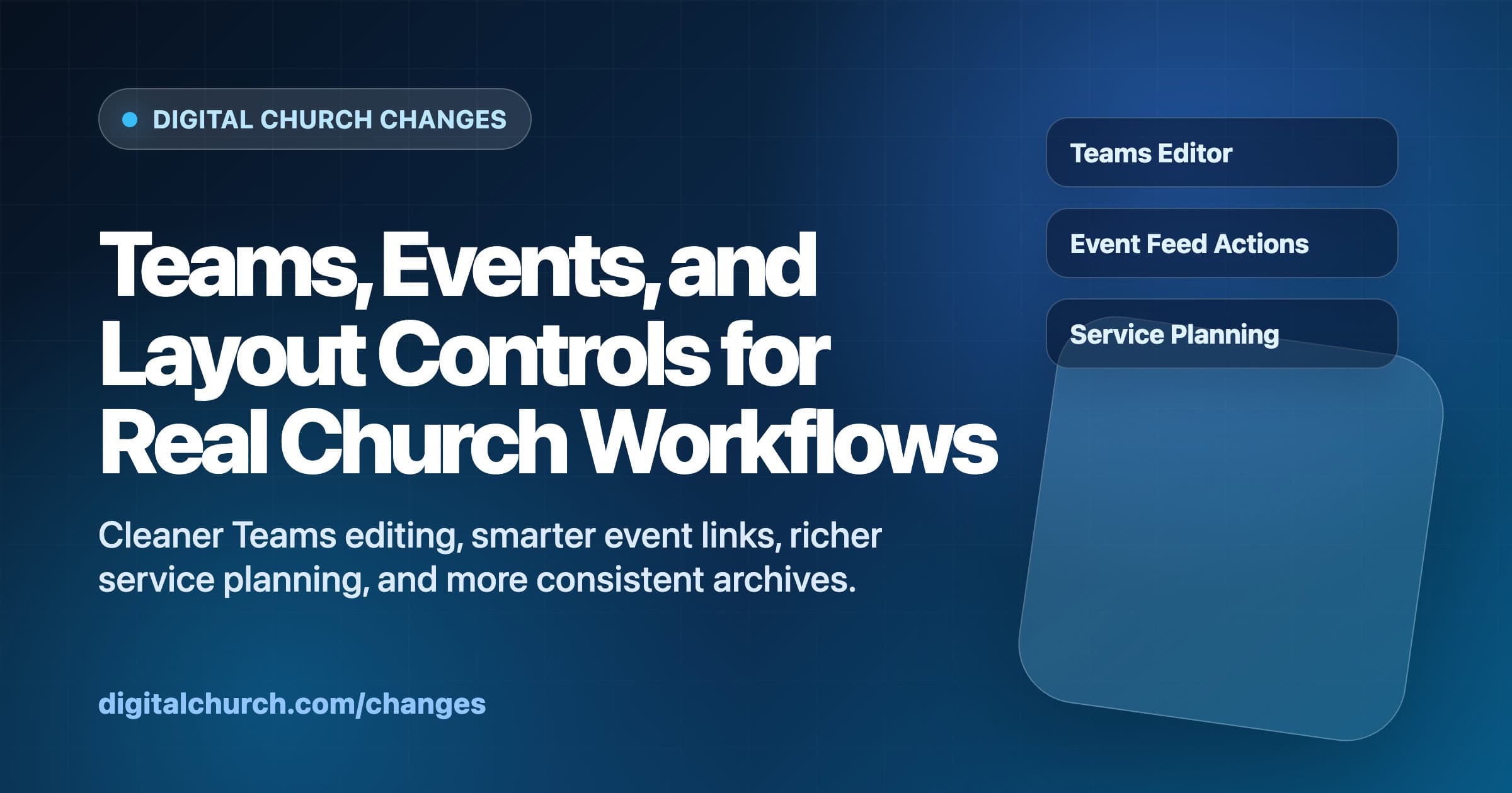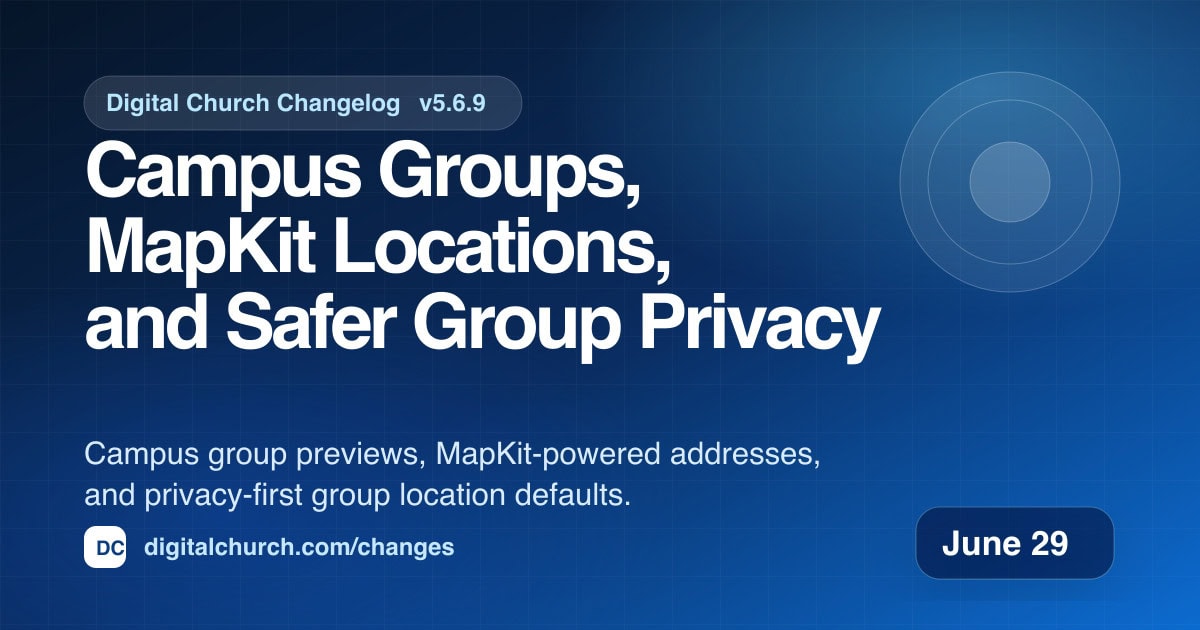
Campus Groups, MapKit Locations, and Safer Group Privacy
This update makes campus-based group ministry easier to present on church websites. Locations can now show their assigned groups, group maps can read the same MapKit address data staff enter in the editor, and exact meeting locations are private unless a church chooses to share them.
The goal is simple: help visitors find the right group without exposing more location detail than the church intended.
Campus Pages Can Show Their Groups
What changed: Single Location pages now include a dynamic Groups section after Upcoming Services and before the map. The section shows published Groups assigned to that campus location and reuses the newer Connect-style group cards.
Why it matters: Multi-campus churches often need location pages to answer more than “when are services?” A campus page should also help someone find community at that campus.
This gives each Location page a clearer ministry path. Visitors can see services, scan available groups, and understand the campus context without bouncing between unrelated archive pages.
Group Archives Stay Scoped to the Selected Campus
What changed: The Location page’s Groups heading now links to the full Groups archive filtered by that campus. The archive keeps the `campus_location` filter across list view, pagination, and heading links.
Why it matters: When someone clicks from a campus page, they expect the next screen to keep that campus selected. Losing the filter makes the site feel random, especially when one church has many groups across multiple campuses.
The filtered archive now behaves like a continuation of the campus page. Visitors can move from the short campus preview to the complete campus group list without re-filtering by hand.
Group Maps Now Use the Editor’s MapKit Address
What changed: Single Group pages parse the MapKit address JSON saved by the native Groups editor. Group archive map data reads those coordinates before falling back to older map fields.
Why it matters: Staff should not have to enter the same address in one place for the editor and another place for the public map. The saved MapKit address should be the source the public site trusts.
This makes map rendering more reliable for new Groups while keeping older data working. It also helps filtered campus maps show the right pins or privacy radius overlays when address data came from the newer editor.
Exact Group Locations Are Private by Default
What changed: Groups now hide exact locations by default. The old “Hide Exact Location” control became “Share Exact Location Publicly,” and the checkbox now acts as an opt-in for public exact-location sharing.
Why it matters: Group locations can be sensitive. Home groups, recovery groups, and family ministries should not accidentally publish exact addresses because a privacy field was never saved.
The new default is safer. Churches can still share an exact pin when that is appropriate, but the public site now starts from privacy and asks for an intentional choice before exposing the address.
Group Editing Handles Real Data Better
What changed: The native Groups editor now loads MapKit JS and the shared token endpoint for address search and preview. The leaders save path also collapses duplicate legacy leader meta rows into the single sanitized ID array expected by REST saves.
Why it matters: These are the kinds of admin fixes that keep staff from losing momentum. Address search should feel modern, and saving leaders should not fail because older metadata still exists in the database.
Together, the editor and frontend now agree on group location data, campus assignments, leader records, and public privacy behavior. That makes Groups feel less like a content type and more like an actual ministry tool.
What This Means for Churches
Campus pages can now tell a fuller story: service times, community options, and location context all in one place. Group maps are more dependable, and privacy defaults are more respectful.
If your church runs campus-based groups, this update is worth reviewing before the next group launch. The right settings can make the public site clearer for visitors and safer for group hosts.